Thursday, October 28, 2010

Examples Of Exterior With Objects

Homework due Tuesday, November 2:
Exterior with Objects
Draw from observation of an exterior space with object that define the space.
Work loose-to-tight, unfinished-to-finished.
Drawing pencil or Charcoal pencil (2B, 4B, 6B)
Consider how line variation can be used to give the illusion of the extreme depth of three-dimensional space provided by an exterior vs. the shallow depth of the still life.

Here are a few examples. Pay special attention to how each student handled the line variation of distant objects versus closer objects. What did each of them do to give the sense of extended, deep space?


Saturday, October 23, 2010

Artists Working "Loose-to-Tight"

We will look at these artists in class, but I thought I'd go ahead and post them here first, so you can take a look for yourself before lecture in class.

Edgar Degas
So, here's a guy with whom I'm sure you are all familiar. Edgar Degas, in his drawings, worked very similarly to how we are working now in class and in the homework assignments. Take a good, careful, analytical look at the drawings below. You will notice that underneath the topmost finished, confident drawing, there is evidence of more gestural work. In many cases notice how, in earlier steps, he often discovered that he had an appendage in the wrong place. Rather than erasing this screw-up, he just moved over and put it in the correct place. He was making his corrections right on top of the mistakes. There are areas where you can see that it took him three or four attempts to get it just right. Now, this man could DRAW, and look at all the mistakes that he made over the course of each picture. So when you, as a first-year college student, find yourself getting frustrated and concerned with making nice perfect lines while working in that first loosened-up underdrawing, remember Degas.


Alberto Giacometti
Here's some of Alberto Giacometti's paintings. His paintings are essentially drawings, not unlike Zak Smith's. Now, Giacometti definitely works "loose-to-tight," but he does one thing I don't want you doing. He places the same amount of pressure and emphasis on the lines of each layer he puts down. I always want you working very lightly in the first and second steps of your drawing process. But Giacometti is good to look at while you are working in this manner because, since he places just as much emphasis on his gestural underdrawing as he does on the more defined final step, you can really see the evidence of his entire process.


Jean-Auguste Dominique Ingres
Ah, here's our old buddy Ingres again. I figured I'd just put one example of his work up here for you to analyze since you've spent plenty of time with him already. Since Ingre saw these drawings as studies for finished paintings (and I've always loved his drawings so much more than the paintings) he wasn't worried about having every area of the drawing perfectly "finished." When you examine his work, you can see that he first blocked out the figure in gestural lines, then came in and gave a bit more finish to areas with which he was mainly concerned, and then came in with the final coup de grace of finished, confident linework (mainly around the face). Now, yes, Ingres' gestural lines still feel rather defined and close to perfect, but that because he's INGRES. This guy trained like a madman for many years to be able to do that. I would never expect that kind of polish from you at this point in your education. What is important, however, is that you look at artists like this--artists who were doing what you are now doing long, long before you--and see what there is to learn, to glean, to adopt from their work.


Paper Loops And Curls

HERE is the past student blog I mentioned in class with examples of the homework due Tuesday.

Wednesday, October 13, 2010

William Anastasi: Drawing Blind

For whatever reason, Blogger isn't letting me embed this video, so here's the link to watch it on NewArtTV:

YOUR Chance To Critique ME

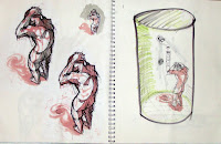
I thought this could be an interesting experiment. Below, I have images taken from old (very old in some cases) sketchbooks of mine when I was a student. Some are from undergrad classes and some are classes I took while attending grad school here at MCA (I won't say which are which). Some are from drawing classes and some are not. So, after you read through the comments I left in your sketchbooks, feel free to browse through my old sketchbook pages here and see if I practiced then what I'm preaching to you now. Then, feel free to critique by posting a comment. It's your turn now. My feelings aren't going to be hurt. So, anything you see that needs to be criticized, praised, or taken out into the street and flogged, you can point it out without fear.


Thursday, October 7, 2010

A WHOLE BUNCH Of Art Stuff Happening Friday Night


John Hood-Taylor: Dystopia

Friday, October 8 · 8:00pm - 10:00pm

P&H Cafe
1532 Madison Ave
Memphis, TN 38104
(901) 726-0906

Dystopia, the antithesis of Utopia, deals with my views on the current social turmoil of our country. Although we live in a land of freedom and opportunity, at times it seems somewhat constrained and isolating. Utopia can exist only in the mind. Once one(s) try to express this ideal in the physical world does the processes become disruptive and culminate in a sort of fracture of the established goal.


Project Sketchbook 2010: The Exhibition

Friday, October 8 · 6:00pm - 10:00pm

Adam Shaw Studio
2547 Broad Avenue
Memphis, TN

The results of Project Sketchbook 2010 will be on display for two weeks opening Friday, October 08, 2010 from 6-10pm at Adam Shaw's Studio on Broad Avenue. Come join us!

Check out http://www.projectsketchbook2010.com/ for details.

Work from: Anastasia Nabakowski, Mary Jo Kamrimnia, AJ Karpinski, Adam Remsen, Alec McIntyre, Alex Paulus, Ariel Claborne, Ashley Luyendyk, Ashley Odum, Baxter Bucks, Beverly Dorsey, Brett Edmonds, Candace Canerdy, Cara Dailey, Caroline Mitchell, Charlie Touvell, Cheri Biggers, Christopher Reyes, Claire M. Ryan, Colin Kidder, Daniel Felt, Darlene Newman, Derrick Dent, Dorothy Spencer, Elaine Miller, Elizabeth Alley, Ellen Mitchell, Gina Burcky, Greg Langford, Gregg Haller, Jen Russell, Jennifer Absher, Jennifer Barnett-Hensel, Jeremiah Mills, Jill C. Denton, Joel Priddy, John Hood-Taylor, Jonathan Payne, Jonathan Postal, Kandice Cook, Lauren Rae Holtemrmann, Lisa Maners, Lisa Tribo, Marilyn Califf, Matthew Pierson, Matthew Roberson, Megan Travis-Carr, Michael Kline, Michele Duckworth, Miriam Oliphant, Moe Seki, Molly Young, Pamela McFarland, Rebecca Shellaberger, Roann Mathia, Robert Pearce, Ruth McElroy, Santana Singleton, Shane McDermott, Siphne Sylve, Stephanie Miller, Susan Younger, T. Matthew Pierson, Lindsay C. Workman, Tiffany Futch, Trici Parker, Vicki Murdock, Vincent Nappi, AND MORE!


Gadsby Creson: 40 Bike Rack Maquettes

Friday, October 8 · 6:00pm - 8:00pm

Urban Art Commission
2549 Broad Ave
Memphis, TN 38112
(901) 454-0474

Friday October 8 will be the opening night of the second exhibition in the UrbanArt exhibition series, Work in Progress, highlighting innovative urban design in the public realm. The second exhibition in the series, 40 Bike Rack Maquettes, is recent work by native Memphian, Gadsby Creson. This series of maquettes explores the opportunity to create functional and innovative designs for bike racks. The artist's hope is that the maquettes will eventually be used as blueprints for bike racks around the City of Memphis. Creson earned her Bachelors of Fine Arts degree from Tufts University/School of the Museum of Fine Arts and is currently a candidate for a Masters of Fine Arts degree at Memphis College of Art.

The opening for 40 Bike Rack Maquettes will be held on Friday October 8 from 6 - 8 PM at the UrbanArt office on Broad Avenue. The exhibition will last from October 8, 2010 through January 28, 2011. Viewings of the exhibition after opening night will be by appointment only. To schedule an appointment to view the exhibition after the opening, please contact info@urbanartcommission.org


MCA faculty, student, and alumni exhibit during the Broad Ave. Artwalk!

Friday, October 8 · 5:00pm - 10:00pm

West Memorials
2481 Broad Ave
Memphis, TN 38112

Tuesday, October 5, 2010

Why Do I Ask You To Keep A Blog?

Why the hell do I have to keep a blog in a drawing class?

If I already have to keep a sketchbook/journal, why do I have to journal on a blog?

I'm always just writing the same stuff on my blog that we end up saying and talking about in class, so isn't the blog just busy work?

How come Jason is the only Drawing 1 teacher making his students keep a blog?

I usually wait until we are past the half-way point in the semester before I answer these questions, which--whether you've vocalized them or not--I am sure many of you are asking. However, since many of the blogs seem it seems are being woefully ignored, I'm posting this now, instead.

Well, there are a several reasons that I ask you to maintain a blog as part of your work experience in this class:

1. If you take a look at your syllabus, you'll notice this sentence in the "course description": The student is expected to develop disciplined work habits and an understanding of the artist's language. Also, under the "course objectives," you'll read this tidbit: 7. Develop skills of observation, personal expression, and abstract thinking. How does one accomplish these skills? Through repetition, and through a regimented schedule of writing down your ideas. No one just suddenly arrives at being an artist. It takes patient, pervasive work. And patient, pervasive work requires a disciplined work ethic. Some students enter college with this work ethic already in place. But it is not merely a natural talent--a work ethic is learned behavior and can be cultivated and honed through lots of writing and written analysis both in private forums (your sketchbook) and open forums which are susceptible to public comment (your blog).

2. I may be giving away a bit too much about myself, but here we go: Here are two paragraphs excerpted from my written teaching philosophy (every college educator has to write one of these):

Beginning Students
My approach to teaching the beginning student is based theoretically on the idea that people learn skill proficiencies through repetition, ritual and ceremony. Repetition is achieved through daily exercises created to teach the student very specific skills such as line-control, color mixing, and compositionally organizing space. Ceremony is achieved through ritualized critiques and dialogues with specific guidelines and parameters designed to encourage assignment-specific discussion and avoid off-topic rambling. At this beginning level, it is essential that the student be introduced to the foundational elements and principles of design and learns to master techniques.

Some New Approaches
In the classroom, I employ some of the newest resources available in order to provide an educational experience that is optimal for the students of our current technological age. This is achieved by utilizing Internet websites such as Blogger, Facebook, and Deviant Art as communication tools. These provide not only a means of transferring information from educator to scholar, but also provide forums in which classmates can connect, discuss, and analyze as a community. Making use of these new approaches in cooperation with the established classroom operation ensures a learning experience that is geared toward reaching a generation of learners who have grown up in the “computer age.”

I think that sums things up in a nutshell.

3. It is important to be ready to promote yourself, your work, and your artistic community using the vast resource that is the Internet. The practice you're getting now by maintaining a blog will better prepare you for maintaining a website at a later point. In fact, many people from many disciplines--not just visual arts--use their blog as a website itself.

Dwayne Butcher, a local Memphis artist, good friend of mine, and Painting 1 instructor at MCA, maintains a blog that generates a huge amount of local and national attention on not only his own art and writing, but on the Memphis art scene as a whole.

Louis Lovhaug, a funny guy who does video critiques of really bad comic books, maintains his blog, "Atop The Fourth Wall", in lieu of an expensive website.

Photographer Nicole Kuntz maintains a blog to showcase her work.

So, I hope this answers any of your questions and puts any of your concerns to rest. If not, and you are still asking why you have to keep a blog, then I can only say this: BECAUSE I SAID SO!